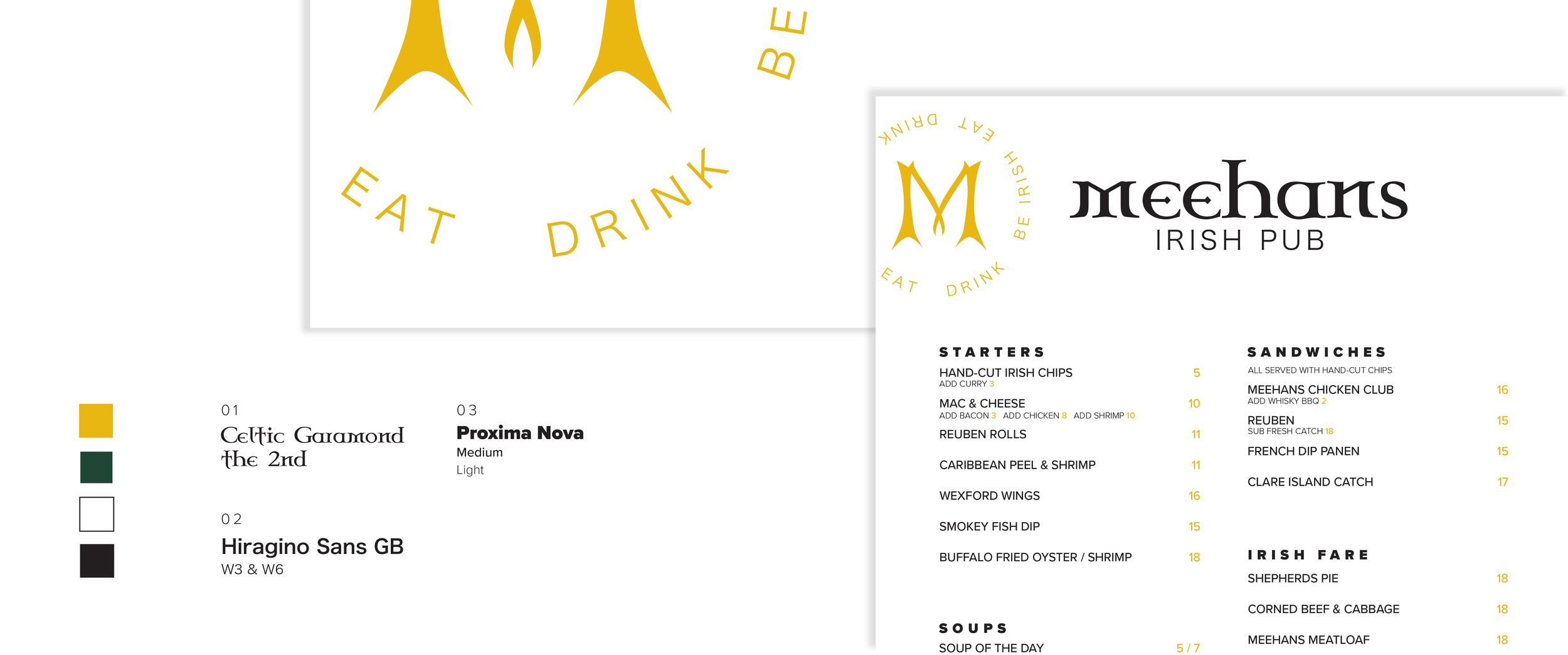
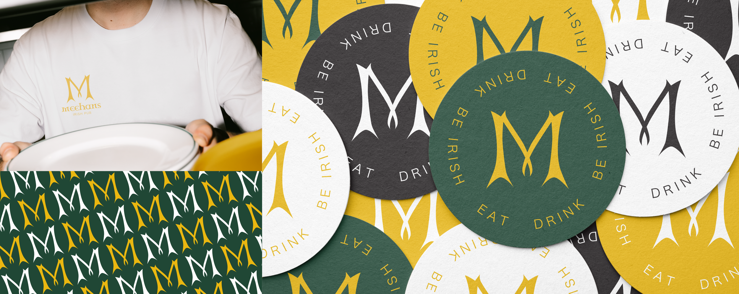
MEEHANS REDESIGN
Meehans, a local Irish restaurant in downtown Saint Augustine, wanted to rebrand the popular location with an elevated simplistic redesign, displaying their Irish heritage. With the focus of a single character, the “M” in Meehan’s, becomes a symbol of recognition through choosing a historical celtic typeface to keep on theme with the brand’s identity. This “M” stays true to the brand's strong Irish messaging already recognizable to the local target audience.